
Neil Armstrong
Michael Collins
Edwin “Buzz” Aldrin
Walter Weber
Michael Collins
James Cooper

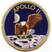
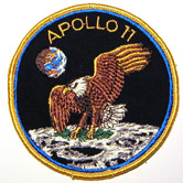
The story of the Apollo 11 patch is well documented by crewmember Michael Collins:
There were also a variety of non-technical chores, such as thinking up names for our spacecraft and designing a mission emblem. We felt Apollo 11 was no ordinary flight, and we wanted no ordinary design, yet we were not professional designers. NASA offered to help us along these lines (wisely, I think). On Gemini 10, which in my view has the best-looking insignia of the Gemini series, artistic Barbara Young had developed one of John’s ideas and come up with a graceful design, an aerodynamic X devoid of names and machines. This was the approach we wanted to take on Apollo 11. We wanted to keep our three names off it because we wanted the design to be representative of everyone who had worked toward a lunar landing, and there were thousands who could take a proprietary interest in it, yet who would never see their names woven into the fabric of a patch. Further, we wanted the design to be symbolic rather than explicit. On Apollo 7, Wally’s patch showed the earth and an orbiting CSM trailing fire. On 9, McDivitt produced a Saturn V, a CSM, and an LM. Apollo 10’s was even busier. Apollo 8’s was closer to our way of thinking, showing a figure eight looping around earth and moon, on a command-module-shaped patch, but it had, like all the rest, three names printed on it. We needed something simpler, yet something which unmistakably said peaceful lunar landing by the United States. Jim Lovell, Neil’s backup, introduced an American eagle into the conversation. Of course! What better symbol — eagles landed, didn’t they? At home I skimmed through my library and finally found what I wanted in a National Geographic book on birds: a bald eagle, landing gear extended, wings partially folded, coming in for a landing. I traced it on a piece of tissue paper and sketched in an oblique view of a pockmarked lunar surface.
Thus the Apollo 11 patch was born, although it had a long way to go before final approval. I added a small earth in the background and drew the sunshine coming from the wrong direction, so that to this day our official insignia shows the earth over the lunar horizon like
when it really should look like
. I also penciled APOLLO around the top of my circular design and ELEVEN around the bottom. Neil didn’t like the ELEVEN because it wouldn’t be understandable to foreigners, so after trying XI and 11, we settled on the latter and put APOLLO 11 around the top. One day outside the simulator I was describing my efforts to Jim Lovell, and he and I both agreed that the eagle alone really didn’t convey the entire message we wanted. The Americans were about to land, but so what? Tom Wilson, our computer expert and simulator instructor, overheard us and piped up, Why not an olive branch as a symbol of our peaceful expedition? Beautiful! Where do eagles carry olive branches? In their beaks, naturally. So I sketched one in, and after a few discussions with Neil and Buzz over color schemes, we were ready to go to press. The sky would be black, not blue, but absolute black, as in the real case. The eagle would be eagle-colored, the moon moon-colored, as described by Apollo 8, and the earth also, so all we had left to play with, really, were the colors of the border and the lettering. We picked blue and gold, and then we
had an illustrator at MSC [James R. Cooper] do the artwork for us. We photographed the finished design and sent a copy through channels to Washington for approval. Washington usually rubber-stamped everything. Only this time they didn’t, and our design came back disapproved.The reason? The eagle’s landing gear, powerful talons extended stiffly below him, was unacceptable. It was too hostile, too warlike; it made the eagle appear to be swooping down on the moon in a very menacing fashion, according to Bob Gilruth. What to do? A gear-up approach was unthinkable to this pilot who had woken up more than once with cold sweats over a dreamed wheels-up landing. Perhaps the talons could be relaxed and softened a bit, made limp like a receiving-line handshake. Then someone had a brainstorm: just transfer the olive branch from beak to claw and all the menace disappeared. The eagle looked slightly uncomfortable in the new version, clutching his branches tightly with both feet, but we resubmitted it anyway, and it greased on through channels and won final approval.
Years later the eagle still pops out at me from unfamiliar places, and the design has even found its way onto the reverse side of the part-silver Eisenhower dollar. This coin was issued during John Connally’s short stint as Secretary of the Treasury, and he was kind enough to pen me a short note in August 1971 stating, among other things: “... the design on the reverse is a rendering of the Apollo 11 insignia.” As if I didn’t know. The “designer” of the coin’s eagle told the press that it was a "happy" eagle, but I don’t know, it still looked uncomfortable to me. I just hoped that it dropped that olive branch before landing.
—Michael Collins, Carrying the Fire
In addition to the Eisenhower silver dollar, the Apollo 11 “eagle landing on the moon” design also appeared on the reverse of the Susan B. Anthony one-dollar coin first issued during the Carter administration.
Obviously popular with patriotically minded astronauts, the Eagle has appeared as a design motif on two additional Apollo mission patches (16 and 17), and on 9 Shuttle mission patches. Its last appearance was on the STS-54 mission patch in 1993.
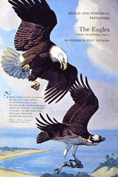
The painting, by Walter Alios Weber, which served as the model for Collins’ eagle. This illustration appeared on page 236 of the book, “Water, Prey, and Game Birds of North America,” published in 1965 by the NGS.

Flip the eagle horizontally, rotate clockwise about 40 degrees, and you have the eagle as it appeared on the Apollo 11 patch. (In fact, the plate in the book is a mirror image of the original painting, which appeared in the July 1950 issue of National Geographic Magazine. So, the orientation of the eagle on the patch matches the orientation in the original painting.)

[ap11-aw1]
NASA photo S69-34875

[ap11-bc1]
Beta cloth version of the Apollo 11 patch.
85mm dia
[ap11-em1]
AB Emblem embroidered Apollo 11 patch. The “APOLLO 11”
is a little too large on this patch, and the ones are missing
the “serifs.” The sky is very dark blue, rather
than Collins' correct black sky. According to Still,
this style is “contemporary”; but I’ve owned this
particular patch since the early 1970s.
102mm w × 105mm h

[ap11-em2]
According to Still, this patch was also manufactured by AB
Emblems. The eagle is a lighter brown, and the lunar surface
has an almost greenish cast. The sky is black velvet. This
is an extremely distinctive patch.
104mm w × 103 mm h

[ap11-em3]
An embroidered Apollo 11 patch made by Lion Brothers. Here
too, the sky is a very dark blue. There is a variant of this
patch in which the yellow thread has much more red in it:
it looks positively orange.
102mm dia
[ap11-em4]
This embroidered patch was manufactured by Voyager Emblems,
Inc., of Niagara Falls, NY, in 1969. The blue and gold are
particularly bold on this patch. The sky is black.
103mm w × 105mm h

[ap11-em5]
This is one of the patches made for the “Biological
Isolation Garments” (BIGs) that the astronauts wore
between the CM and the quarentine trailer when they returned
to earth. This is the best of the embroidered patches I’ve
seen. The Eagle is really faithful to the original artwork.
According John Bisney, it was created by Texas Art Embroidery.
My thanks to Douglas Morton for this image.

